†
ANTIQUES
How to Care for Your Antiques
A simple set of tried and true guidelines to ensure your antiques last for generations to come.
MANY a good antique has been left behind or ruined for lack of proper know-how when it comes to its care. But with the assistance of a few tried and true guidelines and a dose of practical advice, you can confidently acquire and use your antique pieces in your everyday life.
Place with Purpose—The placement of an antique in your home is nearly as important as its acquisition. Aesthetics aside, consider the materials of your piece. Is it an antique textile vulnerable to excess humidity? Is it an antique piece of wood furniture that will whither in front of your heater? Or is it an antique chalk drawing that will roast in the midday sun? While wear of all sorts should be and is embraced by those who love items from the past, there is a fine line between enjoying an item’s patina and hastening its demise.
Wax Your Woods—Among the many attributes of antique wood furniture is its durability. Made from high-quality wood and assembled by incredible craftsmen, it is near impossible to find a modern-made table of the same caliber today on the market. While many people express concern about staining or scratching their antique furniture, it is actually infinitely easier to repair or restore antiques than modern-made pieces. The difference lies in how each was made. Modern furniture often relies on synthetic finishes and composite woods in its production, whereas antique wood furniture can easily be waxed, polished, or mended by yourself or a trusted restorer.
Regular Gentle Maintenance—Like all living, breathing things, antiques need regular gentle maintenance for their longevity and well-being. Think of each season as a time to schedule a check-up. Is the wood on your dining table looking sun-worn or dry? Probably time for a gentle wax. Is your silver oxidized from sitting out on your table? Time for a polish.
Antique Tableware Care
Glassware—Hand wash only with warm, soapy water or a mild detergent. To dry, gently polish with a soft, lint-free cloth to prevent water spots and enhance shine.
Silver—Hand wash only with warm soapy water or a mild detergent using a soft sponge. Immediately dry with a soft, lint-free cloth to prevent tarnish. As needed, use silver polish on both sterling and silver-plate items, gently buff to restore shine. I recommend using Wright’s Silver Cream to polish silver. Store out of the sun in a cloth case or cutlery box.
Linens—Hand wash or launder on gentle with a mild detergent. If possible, lay flat to dry as tumble drying may shrink or damage linens. When ironing, use medium-high heat and gently iron on the reverse side to smooth your fabric and prevent damage. Store in a cool, dry place using acid-free tissue. For stains, I personally recommend dabbing with some white vinegar to prevent the stain from setting in or even pre-treating your linens by soaking them in a solution of one part vinegar to three parts water before washing.
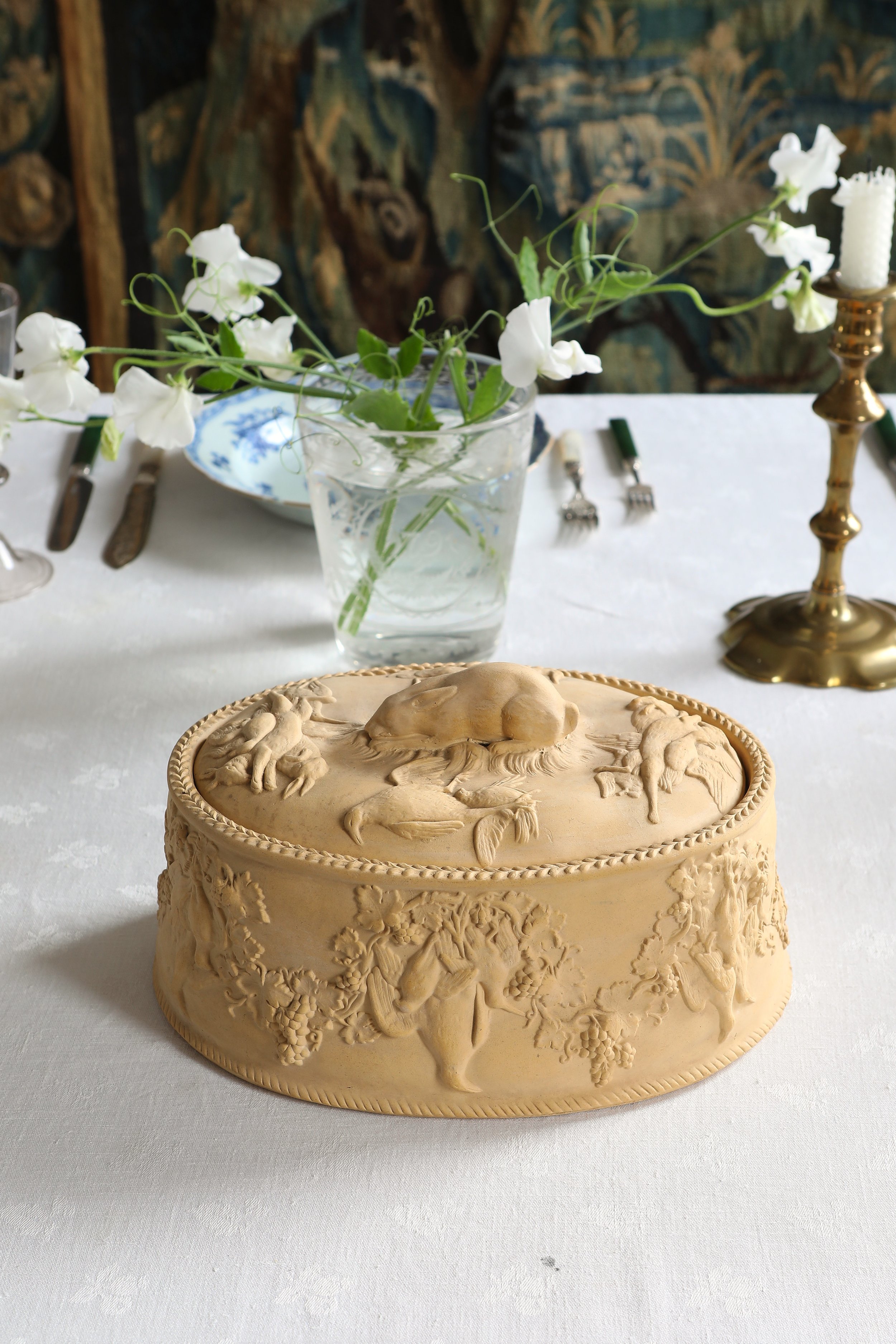
Ceramics—Hand wash only with warm soapy water or a mild detergent using a soft sponge. Wipe with a soft, lint-free cloth to dry. When storing ceramics in-between uses, separate your plates with a piece of kitchen paper or a napkin to prevent scratching.
SHOP OUR FAVORITE PIECES


